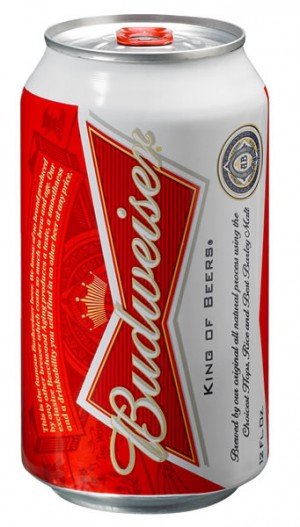
Budweiser redesigned their can because it’s much easier to change the paint in the canning machine rather than doing anything about the beer inside. Beer that’s not exactly great, but yet not bad enough to be considered ironic for hipsters.
The new design features a cleaner look, one that is less ornate, with a heavier reliance on the color red. The name Budweiser is still written in a cursive script, but now the name is cast in white against a red backdrop instead of blue on white.
…or you could just look at the picture.
These cans are also a benefit to the St. Louis community as we can all agree we got pretty tired of seeing empty versions of the old can designs strewn around our neighborhoods and parks. These will certainly spiff the place up quite a bit. Thinking of it that way, the new Budweiser can really should have ditched the classic red for green or asphalt grey to blend right in once thrown from the window of a pickup truck going 80 mph west on 40 through Chesterfield.
The new can also features a QR code for scanning by smart phones.
Oh. My. God. Finally! You know how many times we’ve been drinking a beer and wondered “What am I drinking right now? Geez, I really don’t know…good thing it’s the future so I can pull out my phone, enter the unlock code, flip to page 5 of my apps, press the QR Scanner app, wait for the camera to start working, look at the can…ugh, hold on that’s the label side where it says the name of the beer, so lets rotate the can a bit…take a picture of the QR code, which then takes me to a website, and…Ah ha! We’re drinking a Budweiser.” The future!!
via STLToday