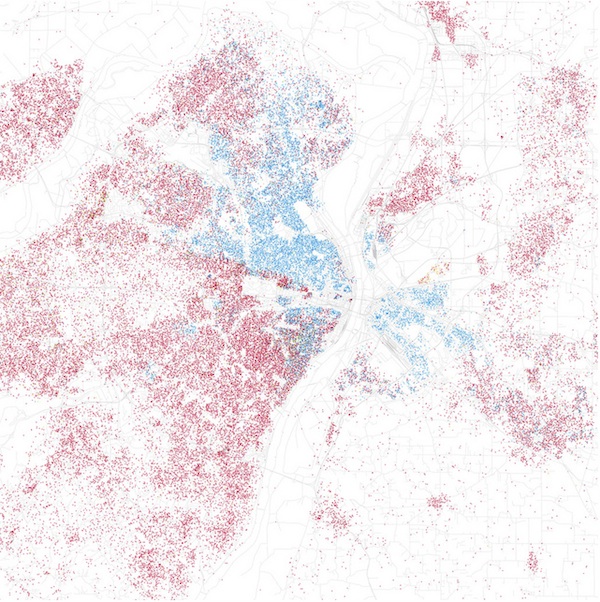
Eric Fischer was inspired by Bill Rankin’s Chicago map of racial and ethnic divides which took the recent Census data and dotted a city map with colored dots equaling groups of the same race…so he did the same thing for other cities. Not sure if this really counts as being “inspired”. “Thought that it was cool so I did the exact same thing.” might be closer.
Below is Fischer’s map of St. Louis. Each dot is 25 people. Red is white, blue is black, green is asian, orange is hispanic and gray is “other”/white guys that wear their hat sideways.
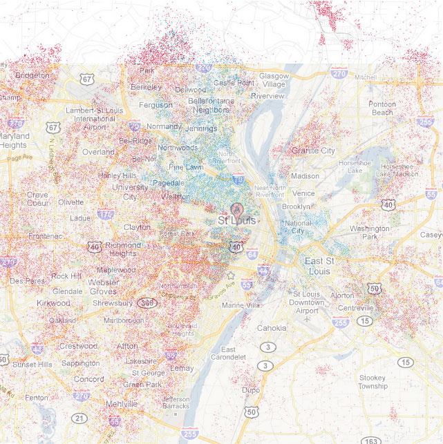
 Ok…we crappily overlaid a Google map on this image for a little clarity.
No surprises here, but it is interesting that South City is far and away the most diverse area in the region. It’s like a real city right there in the middle of this other city which is right next to the two other segregated areas. How lovely!
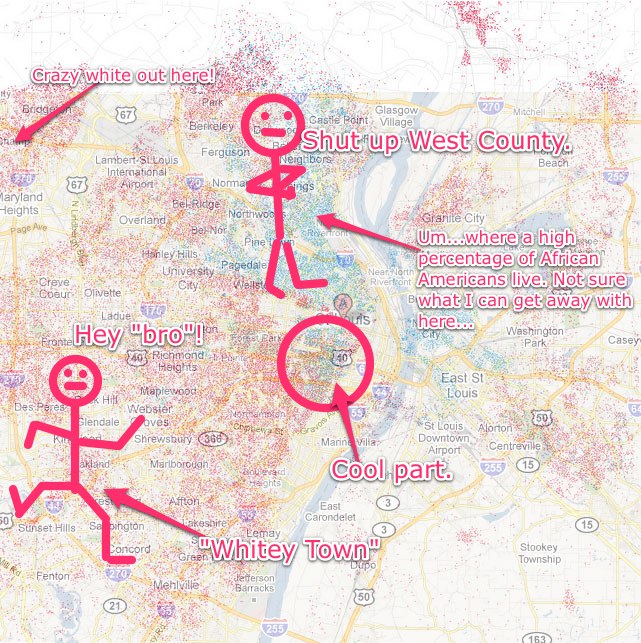
For more clarity, we are over-overlaying some informative notes:
For slightly less clarity, we are now going to overlay a photo of popular morning anchor man John Pertzborn:
Hopefully this was informative.


